Musings
“To rove about, musing, that is to say loitering, is… a good way of spending time”
Victor Hugo
Ed Ruscha
Ed Ruscha’s paintings incorporate words, slogans, and phrases that are both enigmatic and surrealistic. They allude to popular culture in the States and especially life in Los Angeles. Works like: ‘Sand in the Vaseline’ and ‘A Blvd. Called Sunset’
I imagine my penchant for his work is largely due to growing up in the melting pot of Los Angeles – the Hollywood sign never far away, billboards looming in the skies, (see my musings on billboards of LA). In some of Ruscha’s early work fonts used were in context with the word. ‘HONK’ which is in the TATE 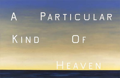 in London, the blocked text jumps out at you much like the sound of a Honk of a horn.
In his later work Ruscha uses a typeface of his own invention named “Boy Scout Utility Modern”. It is an all-cap font, the curved letter forms squared-off, like in the Hollywood sign. The simplicity of the font with the ambiguousness or pithiness of the words and phrases contrast greatly with the grand size which they are painted ( in some cases over thirteen feet high). Hanging in prestigious galleries and museums adds to their irreverence and makes their message even more compelling and thought provoking.
![]()
Billboards
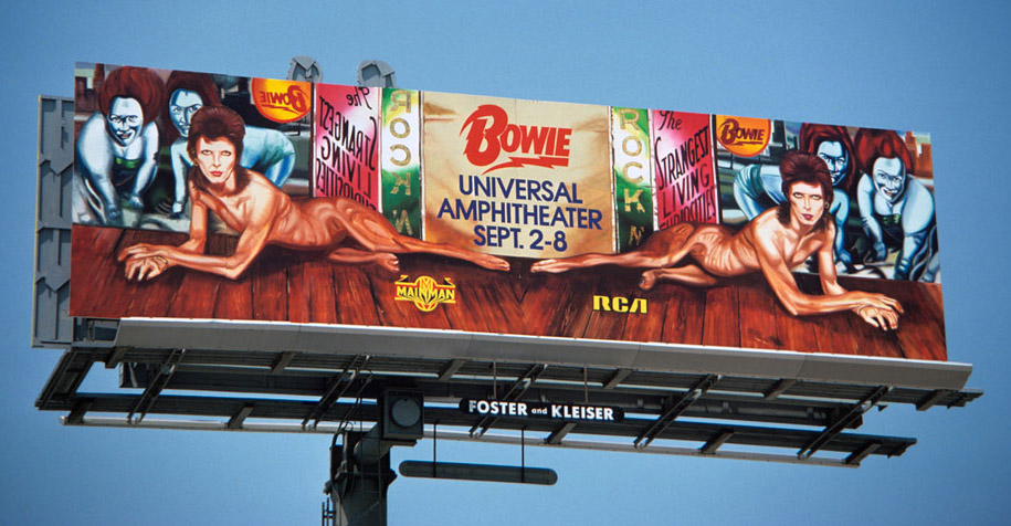
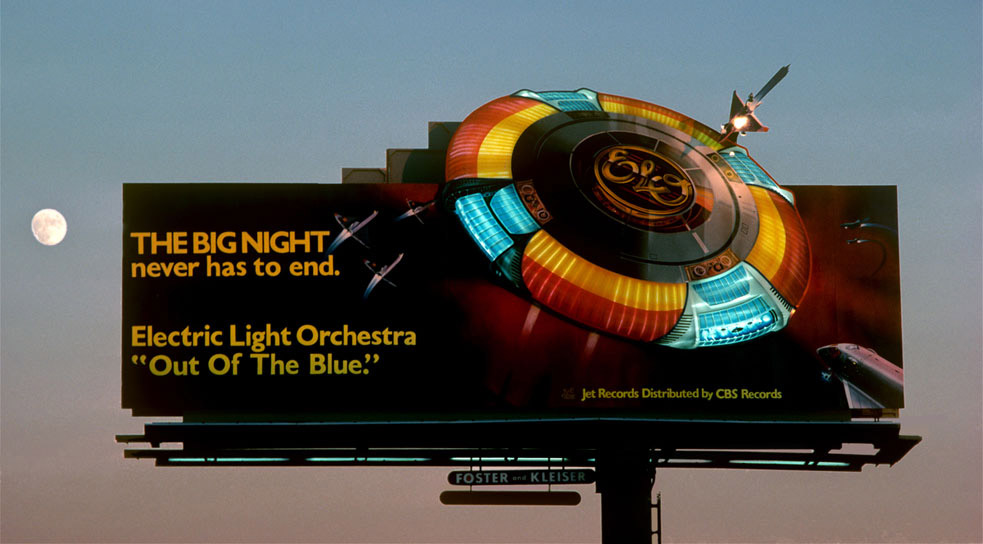
Billboards across LA in the 1970’s and 1980’s, especially those on Sunset Boulevard were bold, brash icons in the sky – The Strip skyline an ever changing gallery (apart from the Marlboro Man, a 70 foot cowboy puffing away – it was there for 17 years before being formally removed.)
On show were strong symbols of consumer culture and pop iconography from music and movies of the day. Rock stars were GIANTS in stature and quite literally up with the Gods. The graphics and designs towered over and compelled you to look up.
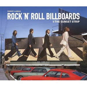
Photographer Robert Landau grew up in Los Angeles in the 1960s and snapped them, he has now done a great book: Rock ‘n’ Roll Billboards of the Sunset Strip which has some superb shots. I was pleased to find several I vividly remember, like David Bowie’s Diamond Dogs gig at Universal Amphitheatre or ELO’s flying saucer and of course Beatles Abbey Road cover (skyline not leafy London but sunshine of California)
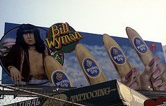
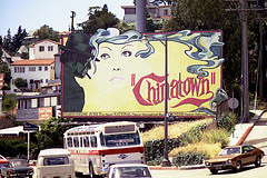
Another photographer who lived near the strip and took slides is Larry Jandro – he has been transposing them from slide and putting them up on a Flickr account. Looking at some of these I am reminded how outrageous some of them were, I don’t know if advertising standards would deem them acceptable now? Here are some of Larry’s snaps, see the full album here.
![]()
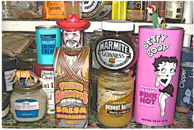
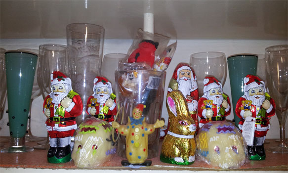
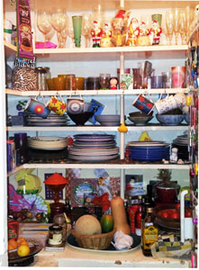
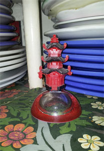
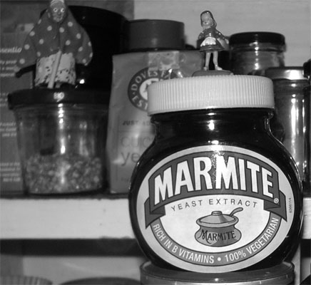
My Larder
Art and graphic design are great sources of nourishment in my life, food completes the trinity and my larder is a dedicated shrine to this pleasure.
Having a traditional walk-in larder I have come to realise its huge significance –to step into a room surrounded by gleaming, tempting treats, ever evolving; packaging acquired for its eccentricity or allure just as much as for its nourishment, some are gifts from friends and visitors – the more exotic or eccentric the better. It feeds the tum as much as the eyes.
My larder has evolved into a canvas of sorts; a small room of constant re-design. Like Aladdin’s cave I open it each day to see it’s wondrous splendor presenting itself, the fruit and veg changing with the seasons, as much as the herbal tea or homemade preserves. A cacophony of labels and products assembled in a tempting and amusing fashion. Oddities of objects sit amongst the food and crockery, which become scenery for these props and add to an ever evolving visual feasting. I am prone to snapping my larder capturing its look as it changes, here are a few:
![]()
Handmade Fonts
Typography and and use of fonts in graphic design, packaging and art has always interested me.
A great online source for original and unusual fonts is HMF (HandMadeFont), an Estonian design company founded by two brothers, Vladimir and Maksim Loginov. Their unique and nontraditional typefaces are not keyable fonts, they are raster images and each letter form has to be hand set and composed or ‘laid down’. While this is done digitally, it is not too far from traditional hand composition/typesetting, which involved placing down ONE letter, punctuation mark or space at a time.
Here is a short video of an origami inspired font in an animated sequence:
About

Musings

Contact