Words, Type, Image, Art: Ed Ruscha
 Ed Ruscha’s paintings incorporate words, slogans, and phrases that are both enigmatic and surrealistic. They allude to popular culture in the States and especially life in Los Angeles. Works like: ‘Sand in the Vaseline’ and ‘A Blvd. Called Sunset’
I imagine my penchant for his work is largely due to growing up in the melting pot of Los Angeles – the Hollywood sign never far away, billboards looming in the skies, (see my musings on billboards of LA). In some of Ruscha’s early work fonts used were in context with the word. ‘HONK’ which is in the TATE 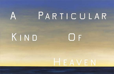 in London, the blocked text jumps out at you much like the sound of a Honk of a horn.
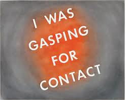
In his later work Ruscha uses a typeface of his own invention named “Boy Scout Utility Modern”. It is an all-cap font, the curved letter forms squared-off, like in the Hollywood sign. The simplicity of the font with the ambiguousness or pithiness of the words and phrases contrast greatly with the grand size which they are painted ( in some cases over thirteen feet high). Hanging in prestigious galleries and museums adds to their irreverence and makes their message even more compelling and thought provoking.
About
Musings

Contact
Leave a Reply